 Kerrang!
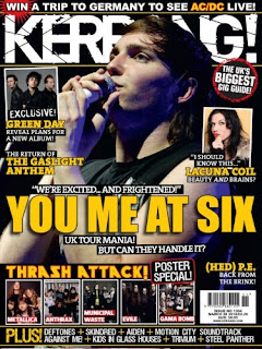
When looking through this music magazine I found that the background is nearly always black, and the other two main colours are white and yellow. As you can see from the front cover of this Kerrang! issue the cover lines are in yellow while the masthead and the rest of the text is in white. This reflects Kerrang!'s house style because it uses black behind all of the white text just to make sure it is all easy to read.
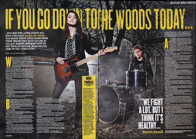
The feature article has a yellow main cover line, which links to the front cover because that also has a yellow main cover line as well so this shows that it is consistent. The main text body is white, which also links to the front cover. Both the front cover and the feature article have big images of artists which shows that it is very important for Kerrang! to link the article/feature article to a face, because it makes them feel like they know them better.
The front cover of the magazine is very busy, since it has lots of images (eight) on one page, but none of the smaller images take away from the dominance of the main cover model artist who is very centralised on the front cover. The other images have white borders around their edges so that they are more separated from background and easier to notice. The font used in the feature article differs from the font on the front cover because the purpose of the pages are different; the front cover is meant to draw the reader in, while the feature article is meant to keep them interested and informed.

The layout of the pages are in some ways similar. The front cover has columns of sorts, 3 bands of information going down, while across the double page spread of the feature article there are columns of the information. The language of the magazine is casual which appeals to its target audience of teenagers more, the use of punctuation in the name of the magazine and the fact that it looks like it's been smashed since it has lines going through it, gives it some extra presence on the page. This also links in with the genre of the magazine, since it's rock which is quite a aggressive genre.
NME (New Musical Express)
The NME magazine has always had the same distinctive masthead, of red text with a white outline, and then a bold black outline around that. This makes it easily recognisable in a shop because it's such a well-known masthead, and in some ways it acts as a logo for the magazine, in a similar way that the Q in a red box of Q magazine does. The masthead is also always in the same place on the front cover, top left corner, which is because it will nearly always be seen in shops if it's in the top left corner.
NME issues always includes cover models on their front covers, normally groups/bands. It looks like they always try to fill it up as much as possible, as if they never have enough space to fit everything they want to include on the front cover. This has the implication on the reader that there is a lot of information in the magazine, which makes the reader want to buy it.
 Another feature is the fact that on the front cover of most issues the cover model(s) are looking directly at the camera lens which is direct address. This makes the reader feel more involved, like they are being involved. The use of the colour red for most of the text shows that this is the dominant colour of the house style. The second colour is white which is what makes up some of the cover lines, and is often the background. White is a good background colour because just about any other colour can go on top of it and stand out, as red and black do on the example front cover.
No comments:
Post a Comment