NME - Royal Blood (September 2014)
Layout and Design (connotations of design)
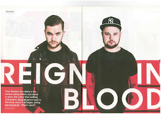
This feature article is spread over more than the 4 pages and is also referred to on the front cover. These 2 double page spreads are the main part of the feature article though, and they sum up what it is about. The first pages of the feature article are the ones with 'Reign in blood' on the front in white with a red background. However the two artists both feature on both double page spreads as well which leaves the audience in no doubt that they are important since their image is in the magazine more than once. The white background at the top creates a contrast with the red below which gives it a sort of emptiness surrounding the dominant image of the two artists. This means that it draws the reader of the magazine to the image and the text below.

I think that it's interesting that they included such a wide picture featuring the artists in the centre in the second image of them. NME could have done this to give us some more context of where they are before we even needed to start reading the text. The connotations of this are that there are two different ways it could be interpreted, both with value being placed on the use of the colour red, 'blood' makes me think of violence, however this is in the name of the artists (Royal Blood). Therefore I feel that the 'reign in blood' links to the band's name, but I think that the red signifies passion.
Mode of Address and Tone
The article speaks to the audience directly from the first word, since the firs word is 'You.' This immediately makes the reader of the article want to continue reading since it is done in a friendly, personal manner. It makes the article all about artists, but also refers to other things that link to the story in different ways, such as one of the artists going to watch another band, Muse.
The tone of the article is very passionate about the artists I feel, it's uses a lot of their own words in the text in order to make it feel all the more about them and linked to them. I don't think that it's got a 'excited' one about it, it doesn't use many if any explanation marks, but it is generally very positive and complimentary of Royal Blood.
Presentation of Royal Blood
The artists are presented to the audience as being cool because they are wearing black leather jackets. This appeals to the target audience of NME because they are young teenagers who are interested in music and so artists need to appeal to to them in order to be successful. They are presented in this way in order to promote them, the article refers to the artists as 'astonishing' which shows that it supports them.
 The article promotes them as a band who's popularity is increasing, and it is trying to keep this shift moving, by referring to fact that they made their début in 2012 and just a couple of years on they have made it into one of the biggest and most well known music magazines in the UK. Royal Blood are therefore shown as a band that's making progress but it also paints a picture of their modesty, they were never aiming for this and were certainly never expecting to get to where they are now. The article itself seems to tell the reader of the magazine about a lot of the band's history and how they begun, which makes the reader feel like they know them more.
Q - Ed Sheeran (September 2011)
Layout and Design
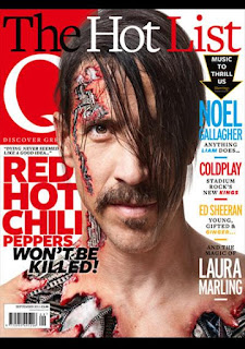
The magazine feature article links to the front cover because one of the cover lines on the front cover refers to the feature article that I have identified. The use of the colour yellow for the cover line could be linking to the fact that Ed Sheeran is ginger. This means that any reader who knows the artists would immediately link the colour of the text to the artist.
The design of the feature article makes reference to Ed Sheeran's earlier life as a singer on the street, as shown in the picture on the double page spread. He is leaning casually against a wall, a connotation of this could be that he is being supported by everyone who's reading this article. The image surrounds the text box, which looks almost like it was added in last, a connotation of this could be that it signifies that the artist's picture is the central part of the article.
Mode of Address and Tone
Compared to the NME article, this Q article is a lot more detached and doesn't really use any personal pronouns. The article does have a sense of interviewing at times, like he is responding clearly to a certain question certain points. I think that there is a sense of the magazine having a voice because it often talks about Ed Sheeran in the third person but it does also quote things that he has said. This adds a sense of personality to the article rather than it just being about him, it also reflects what he thinks about things. The tone of the article is quite calm I think, it doesn't have any negativity really, but at the same time it isn't very enthusiastic about the subject.
Presentation of Ed Sheeran
In the article the artist is presented as being quite casual, which is because of the acoustic guitar in the background of the image. A connotation of this could be that he is on the street singing to earn money and fans of him who would read this article would know that this is what he did in fact do up until a few years ago when he found fame, so this photo of him in London reflects his history. This links to the fact that the target audience are people who are likely to already know him and listen to his music which shows that it is appealing to his fans. The target audience are therefore likely to be ABC1 because they are more likely to be up to date with Britain's culture and modern music. The age range ranges from teenagers to adults but I don't think that it applies to middle-aged adults since the demographic of them is that they prefer rock to pop. The purpose of the article is to inform the reader about the artist and their background, offering 'exclusive' information which draws in people to read it.

No comments:
Post a Comment