Identification of my Readership Profile - including demographics and psychographics
My target audience has an age range of 12-30 and it's genre is pop but it will also include some rock. The general lifestyle of my target audience is people who are quite well off so it includes pre-dominantly middle-class consumers but some working-class people may also read it. The majority of my audience is mostly students and people who have just entered work since most of my audience will be in the age brackets of either teenagers or young adults.
The reader of my magazine has a good income, which they use to support their other hobbies which include sport but also devoting a reasonable amount of time to their technology-based life including social media and TV. They consume media through these two and also magazines mainly but most of my target readership do use most of the different media types. They also spend a lot of time listening to their favourite music (pop) and most of the readers have been to at least one big gig, a large proportion of them like to attend at least one gig per month in order to meet their love of music, therefore this links to the fact that a lot of my target audience are very interested in their music hobby, and this magazine's intention is to keep them up to date on all the latest tour/gig dates. Their demographics also include their job, which is to be
Some of the adverts in the magazine will therefore be advertising certain artists' gigs. The magazine is going to be an average price since I think that this is the best way to appeal to my target audience; which is that it's not so expensive that the average reader cannot afford it but not so cheap that a massive proportion of it is filled with adverts that the target audience will get bored of and will therefore not be interested in buying the magazine again. Other products that could feature in adverts in the magazine could be technology such as beats headphones and devices such as phones and music players e.g.Apple iPhone. I don't think that clothes would be a good use of the advertising space since I am targeting both genders for my magazine and so it will be difficult to get clothes to appeal to both audiences.
I intend the magazine to have a casual (but at the same time quite informative) style in order to build up a brand image of it being reliable and a good magazine to get into and enjoy, so that the reader thinks it is a worthwhile which means that they are more likely to lend it to friends, or recommend it to friends to buy themselves. Their disposable income will be quite high, between £25-£80 per week, which they spend on music, games and going to the cinema/into town every other week.
The psychographics of my target audience will be mainly explorers with some aspirers and reformers in there also. This is because my magazine will be quite informative and so won't appeal to aspirers quite as much since they would get something based on what it looks like, without thinking as much about what is in it.
The NRS social grades of my audience would be BC1 since the magazine is not professional-looking which is what the average person who comes into the grade A on the social grade would expect. The magazine will have quite a casual tone but it is intended to still present interesting information about the artists and albums/singles that they are talking about, since it's a music magazine.
Character Profile
Liam is a teenager who is entering higher education. He is 17 years old and worked quite hard at school to get the grades that he needed. He goes out with his friends regularly to nightclubs and gigs at least once a month. He has liked music as a hobby but is also starting to consider it as a more serious passion. He buys music on his phone, he does not use CDs any more since he likes to listen to his music on the go.
Friday, 16 October 2015
Wednesday, 14 October 2015
Initial Ideas
I have decided to go with Idea 3, because I believe that it is the idea that best fits in with what I would be most likely to read and so I can make it using my own feelings more since they are more relevant. I think that there is a gap in the target market for this magazine because it appeals to to a wide range of ages and I hope for it to be gender neutral however if this is not possible then I may have to make it lean to a male audience more.
Although I believe there is a big market for this magazine I think that it will have competition from magazines such as Q because they cover the same genres, however I think that my magazine will stand out because of its colour scheme/house style, but also its informative yet casual style.
Although I believe there is a big market for this magazine I think that it will have competition from magazines such as Q because they cover the same genres, however I think that my magazine will stand out because of its colour scheme/house style, but also its informative yet casual style.
Monday, 12 October 2015
House Style of Existing Music Magazines
A magazine's house style is shown through the use of font, colour, language, layout on the pages and visual features such as images. These are often referred to as the conventions of the magazine in that they are consistent not just in one issue, but over all the issues of the same magazine.
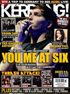 Kerrang!
When looking through this music magazine I found that the background is nearly always black, and the other two main colours are white and yellow. As you can see from the front cover of this Kerrang! issue the cover lines are in yellow while the masthead and the rest of the text is in white. This reflects Kerrang!'s house style because it uses black behind all of the white text just to make sure it is all easy to read.
The feature article has a yellow main cover line, which links to the front cover because that also has a yellow main cover line as well so this shows that it is consistent. The main text body is white, which also links to the front cover. Both the front cover and the feature article have big images of artists which shows that it is very important for Kerrang! to link the article/feature article to a face, because it makes them feel like they know them better.
The front cover of the magazine is very busy, since it has lots of images (eight) on one page, but none of the smaller images take away from the dominance of the main cover model artist who is very centralised on the front cover. The other images have white borders around their edges so that they are more separated from background and easier to notice. The font used in the feature article differs from the font on the front cover because the purpose of the pages are different; the front cover is meant to draw the reader in, while the feature article is meant to keep them interested and informed.
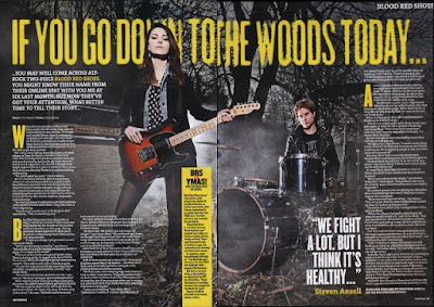
The layout of the pages are in some ways similar. The front cover has columns of sorts, 3 bands of information going down, while across the double page spread of the feature article there are columns of the information. The language of the magazine is casual which appeals to its target audience of teenagers more, the use of punctuation in the name of the magazine and the fact that it looks like it's been smashed since it has lines going through it, gives it some extra presence on the page. This also links in with the genre of the magazine, since it's rock which is quite a aggressive genre.
NME (New Musical Express)
The NME magazine has always had the same distinctive masthead, of red text with a white outline, and then a bold black outline around that. This makes it easily recognisable in a shop because it's such a well-known masthead, and in some ways it acts as a logo for the magazine, in a similar way that the Q in a red box of Q magazine does. The masthead is also always in the same place on the front cover, top left corner, which is because it will nearly always be seen in shops if it's in the top left corner.
NME issues always includes cover models on their front covers, normally groups/bands. It looks like they always try to fill it up as much as possible, as if they never have enough space to fit everything they want to include on the front cover. This has the implication on the reader that there is a lot of information in the magazine, which makes the reader want to buy it.
 Another feature is the fact that on the front cover of most issues the cover model(s) are looking directly at the camera lens which is direct address. This makes the reader feel more involved, like they are being involved. The use of the colour red for most of the text shows that this is the dominant colour of the house style. The second colour is white which is what makes up some of the cover lines, and is often the background. White is a good background colour because just about any other colour can go on top of it and stand out, as red and black do on the example front cover.
 Kerrang!
When looking through this music magazine I found that the background is nearly always black, and the other two main colours are white and yellow. As you can see from the front cover of this Kerrang! issue the cover lines are in yellow while the masthead and the rest of the text is in white. This reflects Kerrang!'s house style because it uses black behind all of the white text just to make sure it is all easy to read.
The feature article has a yellow main cover line, which links to the front cover because that also has a yellow main cover line as well so this shows that it is consistent. The main text body is white, which also links to the front cover. Both the front cover and the feature article have big images of artists which shows that it is very important for Kerrang! to link the article/feature article to a face, because it makes them feel like they know them better.
The front cover of the magazine is very busy, since it has lots of images (eight) on one page, but none of the smaller images take away from the dominance of the main cover model artist who is very centralised on the front cover. The other images have white borders around their edges so that they are more separated from background and easier to notice. The font used in the feature article differs from the font on the front cover because the purpose of the pages are different; the front cover is meant to draw the reader in, while the feature article is meant to keep them interested and informed.

The layout of the pages are in some ways similar. The front cover has columns of sorts, 3 bands of information going down, while across the double page spread of the feature article there are columns of the information. The language of the magazine is casual which appeals to its target audience of teenagers more, the use of punctuation in the name of the magazine and the fact that it looks like it's been smashed since it has lines going through it, gives it some extra presence on the page. This also links in with the genre of the magazine, since it's rock which is quite a aggressive genre.
NME (New Musical Express)
The NME magazine has always had the same distinctive masthead, of red text with a white outline, and then a bold black outline around that. This makes it easily recognisable in a shop because it's such a well-known masthead, and in some ways it acts as a logo for the magazine, in a similar way that the Q in a red box of Q magazine does. The masthead is also always in the same place on the front cover, top left corner, which is because it will nearly always be seen in shops if it's in the top left corner.
NME issues always includes cover models on their front covers, normally groups/bands. It looks like they always try to fill it up as much as possible, as if they never have enough space to fit everything they want to include on the front cover. This has the implication on the reader that there is a lot of information in the magazine, which makes the reader want to buy it.
 Another feature is the fact that on the front cover of most issues the cover model(s) are looking directly at the camera lens which is direct address. This makes the reader feel more involved, like they are being involved. The use of the colour red for most of the text shows that this is the dominant colour of the house style. The second colour is white which is what makes up some of the cover lines, and is often the background. White is a good background colour because just about any other colour can go on top of it and stand out, as red and black do on the example front cover.
What do Audiences want from a Music Magazine?
A music magazine is a physical thing that you can go into a shop and buy, but if that was it then no one would buy it. In order for a music magazine to sell copies it has to be interesting for the audience. Most of the audience would want it to provide lots of information that they find interesting which means that they can enjoy reading it. Therefore the information must be presented in an easy-to-read way so that the majority of the readership can understand what it is talking about.
It must maintain the same tone throughout the magazine's issues and in most cases it must be consistent. For example, if a rock magazine such as Rock Sound started talking about classical music then it's going to loose most of its target readership who buy it because the majority of them won't want to read about classical music. The genre of a music magazine must reflect the audience that read it. For example Kerrang! focuses on attracting a teenage and young adult audience who like rock music while NME focuses on wider range of genres (alternative, rock and indie) which shows that it is more generalised, so people who buy NME are likely to music overall, but it focuses on alternative, rock and indie, while Kerrang! goes into a lot more detail in the rock genre.

Magazines can not just appeal to their audiences through their content either, they can also do this through use of incentives such as CDs, posters and competitions. Posters are most likely to appeal to teenagers, but as the graph shows, overall the biggest incentive for a reader to buy a magazine would be a CD accompanying the magazine.
The demand of the audience of a music magazine is constantly changing which reflects the fact that most of the information that they provide to readers is now available online. To counteract this music magazines are being made available online as well to reach the bigger audiences again.
This development is specifically focused around the fact that the current young generation are mostly online, spending a lot of their time on social networking sites. A free magazine such as NME therefore stands to benefit the most from this because it doesn't need to restrict who is copying it as much since it doesn't need to charge for every issue it sells. In fact, this would benefit it because it means that its adverts are reaching more people so it makes more money.
The results of my research will help me to plan my own magazine because I now know that posters have a much bigger draw-in factor than competitions so I need to advertise this on my magazine's front cover.
It must maintain the same tone throughout the magazine's issues and in most cases it must be consistent. For example, if a rock magazine such as Rock Sound started talking about classical music then it's going to loose most of its target readership who buy it because the majority of them won't want to read about classical music. The genre of a music magazine must reflect the audience that read it. For example Kerrang! focuses on attracting a teenage and young adult audience who like rock music while NME focuses on wider range of genres (alternative, rock and indie) which shows that it is more generalised, so people who buy NME are likely to music overall, but it focuses on alternative, rock and indie, while Kerrang! goes into a lot more detail in the rock genre.

Magazines can not just appeal to their audiences through their content either, they can also do this through use of incentives such as CDs, posters and competitions. Posters are most likely to appeal to teenagers, but as the graph shows, overall the biggest incentive for a reader to buy a magazine would be a CD accompanying the magazine.
The demand of the audience of a music magazine is constantly changing which reflects the fact that most of the information that they provide to readers is now available online. To counteract this music magazines are being made available online as well to reach the bigger audiences again.
This development is specifically focused around the fact that the current young generation are mostly online, spending a lot of their time on social networking sites. A free magazine such as NME therefore stands to benefit the most from this because it doesn't need to restrict who is copying it as much since it doesn't need to charge for every issue it sells. In fact, this would benefit it because it means that its adverts are reaching more people so it makes more money.
The results of my research will help me to plan my own magazine because I now know that posters have a much bigger draw-in factor than competitions so I need to advertise this on my magazine's front cover.
Target Readership of 3 Existing Magazines
Q Magazine (published by Bauer Consumer Media)
The target readership of the Q magazine is younger adults and it appeals to mostly men, in fact about 66% of Q magazine's readership is male. It's thought that about 84% of the readers of Q are 15-44 years old. Therefore this shows Q’s ability to make the magazine appeal to a wide range of ages and as well as the different social groups, which are often referred to using the National Readership Survey (NRS).
Q does this by featuring currently popular artists such as Adele as well as classic artists like John Lennon, they even feature artists that are deceased as some issues are dedicated to them. For example John Lennon to celebrate his 70th birthday, and Amy Winehouse featured on an issue after her death. The main readership of Q magazine seem to be those who like either alternative or indie music, since these are the two genres that it seems to focus on most.
Having looked at a Q music magazine I noticed that there seem to be a lot of advertisements for gigs which suggests that a lot of its readership would be interested in going to them, or attend them regularly, so this information is important because it tells them about their favourite artist's tour dates so that they can book the tickets.
Rock Sound
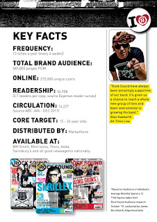
This magazine is different from Q because it has a smaller target audience of pre-dominantly men (they make up 72% of Rock Sounds readership). It also has a smaller age range of 15-24 years which shows how much dominance it has in this sector considering how many people read it.
Teenagers would buy the magazine because it is a great way for them to keep in touch with the latest fashion. Staying connected is a very important part of their lives, teenagers value getting constant updates about everything, and the ways readers connect with Rock Sound is print, the internet and social networking. 82% of their audience use at least two of these ways to stay connected with their favourite artists which shows that they are willing to spend time and money on this hobby, which is reflected in the magazine's £3.99 price tag.
 The circulation of the magazine has been steadily decreasing in recent years, as shown in the figures of 16374 being circulated in 2009 which went down to about 15000 in 2010, and then went down by almost another 800 to 14227 in 2011. This shows that the readership is decreasing as more and more people turn to the internet as an easier source of information rather than going out to a shop and buying a magazine.
When comparing the genres of Rock Sound to Q, I found that Rock sound focuses on Rock and Pop Punk, and barely mentions Indie music at all, whereas one of Q magazine's main genres is Indie.
NME - New Musical Express (published by IPC)
NME is a indie-rock magazine that has been running for a very long time in Britain, far longer than Q and Rock Sound. This means that it has been able to build up a large fan base since it was one of the first music magazines, and is still running.
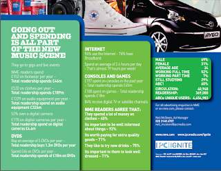
Like Rock Sound NME is very centralised around men, with them making up 69% of it's total readership. As shown in the pie charts, the majority of the readership are ABC1 which is reflected in the fact that over half of the readership of NME are working full time, however, since NME is now free all social groups can get it. Students make up a big proportion (29%) of the readership also, which shows that they are interested in the magazine.
The magazine targets mainly an audience who are very into music and like to know more about the artists. This shows that music plays a big part in their life, since as with Rock Sound they like to go to lots of gigs. Today, NME is free, which is an effort to increase the circulation of the magazine. Therefore even though this would decrease the money they make the magazine can survive off of advertising.
The target readership of the Q magazine is younger adults and it appeals to mostly men, in fact about 66% of Q magazine's readership is male. It's thought that about 84% of the readers of Q are 15-44 years old. Therefore this shows Q’s ability to make the magazine appeal to a wide range of ages and as well as the different social groups, which are often referred to using the National Readership Survey (NRS).
Q does this by featuring currently popular artists such as Adele as well as classic artists like John Lennon, they even feature artists that are deceased as some issues are dedicated to them. For example John Lennon to celebrate his 70th birthday, and Amy Winehouse featured on an issue after her death. The main readership of Q magazine seem to be those who like either alternative or indie music, since these are the two genres that it seems to focus on most.
Having looked at a Q music magazine I noticed that there seem to be a lot of advertisements for gigs which suggests that a lot of its readership would be interested in going to them, or attend them regularly, so this information is important because it tells them about their favourite artist's tour dates so that they can book the tickets.

Rock Sound
This magazine is different from Q because it has a smaller target audience of pre-dominantly men (they make up 72% of Rock Sounds readership). It also has a smaller age range of 15-24 years which shows how much dominance it has in this sector considering how many people read it.
Teenagers would buy the magazine because it is a great way for them to keep in touch with the latest fashion. Staying connected is a very important part of their lives, teenagers value getting constant updates about everything, and the ways readers connect with Rock Sound is print, the internet and social networking. 82% of their audience use at least two of these ways to stay connected with their favourite artists which shows that they are willing to spend time and money on this hobby, which is reflected in the magazine's £3.99 price tag.
 The circulation of the magazine has been steadily decreasing in recent years, as shown in the figures of 16374 being circulated in 2009 which went down to about 15000 in 2010, and then went down by almost another 800 to 14227 in 2011. This shows that the readership is decreasing as more and more people turn to the internet as an easier source of information rather than going out to a shop and buying a magazine.
When comparing the genres of Rock Sound to Q, I found that Rock sound focuses on Rock and Pop Punk, and barely mentions Indie music at all, whereas one of Q magazine's main genres is Indie.
NME - New Musical Express (published by IPC)
NME is a indie-rock magazine that has been running for a very long time in Britain, far longer than Q and Rock Sound. This means that it has been able to build up a large fan base since it was one of the first music magazines, and is still running.

Like Rock Sound NME is very centralised around men, with them making up 69% of it's total readership. As shown in the pie charts, the majority of the readership are ABC1 which is reflected in the fact that over half of the readership of NME are working full time, however, since NME is now free all social groups can get it. Students make up a big proportion (29%) of the readership also, which shows that they are interested in the magazine.
The magazine targets mainly an audience who are very into music and like to know more about the artists. This shows that music plays a big part in their life, since as with Rock Sound they like to go to lots of gigs. Today, NME is free, which is an effort to increase the circulation of the magazine. Therefore even though this would decrease the money they make the magazine can survive off of advertising.
Saturday, 10 October 2015
Tuesday, 6 October 2015
Analysis of Feature Articles
NME - Royal Blood (September 2014)
Layout and Design (connotations of design)
This feature article is spread over more than the 4 pages and is also referred to on the front cover. These 2 double page spreads are the main part of the feature article though, and they sum up what it is about. The first pages of the feature article are the ones with 'Reign in blood' on the front in white with a red background. However the two artists both feature on both double page spreads as well which leaves the audience in no doubt that they are important since their image is in the magazine more than once. The white background at the top creates a contrast with the red below which gives it a sort of emptiness surrounding the dominant image of the two artists. This means that it draws the reader of the magazine to the image and the text below.
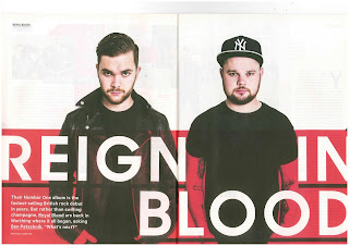
I think that it's interesting that they included such a wide picture featuring the artists in the centre in the second image of them. NME could have done this to give us some more context of where they are before we even needed to start reading the text. The connotations of this are that there are two different ways it could be interpreted, both with value being placed on the use of the colour red, 'blood' makes me think of violence, however this is in the name of the artists (Royal Blood). Therefore I feel that the 'reign in blood' links to the band's name, but I think that the red signifies passion.
Mode of Address and Tone
The article speaks to the audience directly from the first word, since the firs word is 'You.' This immediately makes the reader of the article want to continue reading since it is done in a friendly, personal manner. It makes the article all about artists, but also refers to other things that link to the story in different ways, such as one of the artists going to watch another band, Muse.
The tone of the article is very passionate about the artists I feel, it's uses a lot of their own words in the text in order to make it feel all the more about them and linked to them. I don't think that it's got a 'excited' one about it, it doesn't use many if any explanation marks, but it is generally very positive and complimentary of Royal Blood.
Presentation of Royal Blood
The artists are presented to the audience as being cool because they are wearing black leather jackets. This appeals to the target audience of NME because they are young teenagers who are interested in music and so artists need to appeal to to them in order to be successful. They are presented in this way in order to promote them, the article refers to the artists as 'astonishing' which shows that it supports them.
 The article promotes them as a band who's popularity is increasing, and it is trying to keep this shift moving, by referring to fact that they made their début in 2012 and just a couple of years on they have made it into one of the biggest and most well known music magazines in the UK. Royal Blood are therefore shown as a band that's making progress but it also paints a picture of their modesty, they were never aiming for this and were certainly never expecting to get to where they are now. The article itself seems to tell the reader of the magazine about a lot of the band's history and how they begun, which makes the reader feel like they know them more.
Q - Ed Sheeran (September 2011)
Layout and Design
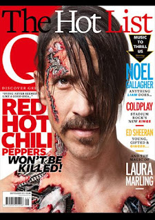
The magazine feature article links to the front cover because one of the cover lines on the front cover refers to the feature article that I have identified. The use of the colour yellow for the cover line could be linking to the fact that Ed Sheeran is ginger. This means that any reader who knows the artists would immediately link the colour of the text to the artist.
The design of the feature article makes reference to Ed Sheeran's earlier life as a singer on the street, as shown in the picture on the double page spread. He is leaning casually against a wall, a connotation of this could be that he is being supported by everyone who's reading this article. The image surrounds the text box, which looks almost like it was added in last, a connotation of this could be that it signifies that the artist's picture is the central part of the article.
Mode of Address and Tone
Compared to the NME article, this Q article is a lot more detached and doesn't really use any personal pronouns. The article does have a sense of interviewing at times, like he is responding clearly to a certain question certain points. I think that there is a sense of the magazine having a voice because it often talks about Ed Sheeran in the third person but it does also quote things that he has said. This adds a sense of personality to the article rather than it just being about him, it also reflects what he thinks about things. The tone of the article is quite calm I think, it doesn't have any negativity really, but at the same time it isn't very enthusiastic about the subject.
Presentation of Ed Sheeran
In the article the artist is presented as being quite casual, which is because of the acoustic guitar in the background of the image. A connotation of this could be that he is on the street singing to earn money and fans of him who would read this article would know that this is what he did in fact do up until a few years ago when he found fame, so this photo of him in London reflects his history. This links to the fact that the target audience are people who are likely to already know him and listen to his music which shows that it is appealing to his fans. The target audience are therefore likely to be ABC1 because they are more likely to be up to date with Britain's culture and modern music. The age range ranges from teenagers to adults but I don't think that it applies to middle-aged adults since the demographic of them is that they prefer rock to pop. The purpose of the article is to inform the reader about the artist and their background, offering 'exclusive' information which draws in people to read it.
Monday, 5 October 2015
Subscribe to:
Comments (Atom)


